
Creating brand identity system to launch a FinTech powerhouse
Linear is formed through the combination of industry leaders ODX and Fundation. Both companies provided very similar offerings to customers and it became clear that joining forces (including resources, knowledge, and investment funding) made strategic sense. ODX would bring its platform and technology expertise to the table, while Fundation would bring its strong sales team and a large roster of clients.
In collaboration with Something Else Works
Project Summary
Context
As ODX’s design lead, I felt it was important to ensure there was strong cohesion between Linear’s marketing touchpoints (focus on prospective clients) and the platform experience (focus on the current clients).
Problem
TL,DR; Design a brand identity for Linear that differentiates itself from other FinTech, enterprise platforms, and feels like a credible technology product that financial institutions trust
Primary buyers - Chief Technology Officer, Head of Business Banking
Secondary buyers - Head of IT, Senior leaders in product and technology, Head of Operations
Solution
TL,DR; Dual track the creation of a design system and feature production, prioritizing quick but impactful wins
Armed with a small budget of $10,000 USD and a timeline of 8 weeks, I pitched taking the project in-house and developing an MVP brand strategy rather than just a logo and color scheme. I decided to hire a talented brand design freelancer (Lauren Gallagher) rather than a brand agency that tends to have more overhead. The in-house team was able to collaborate closely with Lauren and work more nimbly.
Business Outcomes
In 2 months…
🚀 MVP brand strategy created
👏 100% buy-in from executive stakeholders
💻 First brand portal created
Company
ODX (rebranded to LinearFT, later acquired by Amount)
Role
Product Design Lead
(100% Management)
Team
1 IC Product Designer
1 Freelance Brand Designer
Timeframe
V1: 2 months
MVP Strategy
What does success look like?
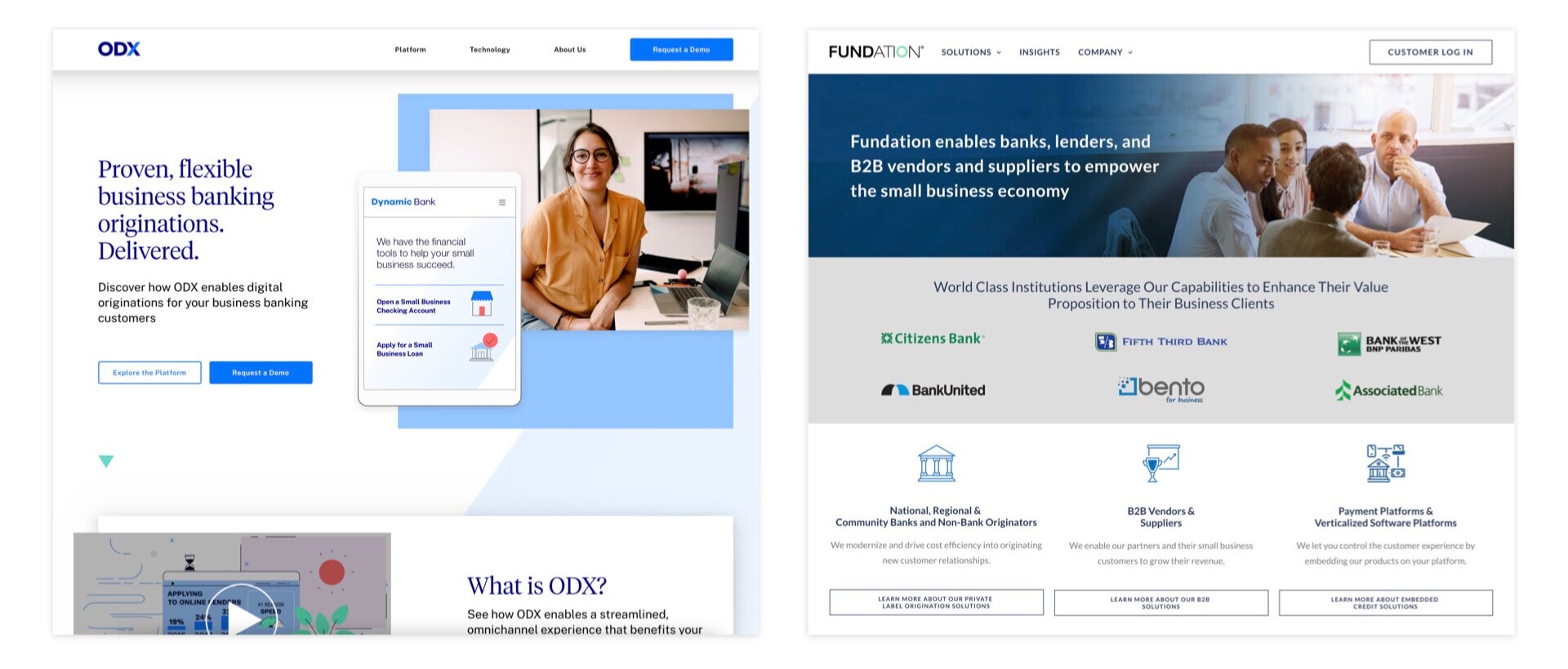
The ODX and Fundation brands were dated and visually different
Scalable
Work with our sub-brands/sub-products and when co-branded with partners
Be ADA-compliant
Not fall apart at a large or small scale
Cost-effective
Work well within our existing design system to reduce the amount of rework for our platform experience (i.e., we use Public Sans as our platform font, so our brand typography would have to use Public Sans or work well with it)
Use open-source assets (font, icons) and be easy to replicate for our currently small in-house design team
Unique
Make it easy for our finance-focused target market to remember (Can they draw our logo on a napkin?)
Feel like it belongs within the FinTech space but not copy other logo tropes
Stakeholder Alignment
Linear’s executive stakeholders didn’t have deep experience with brand strategy and design. One of my main focuses was educating them on how and why a strong brand strategy would elevate the Linear brand.
Competitive Analysis
Because we operate in the B2B space, the opportunity to distinguish ourselves was larger than in other consumer-facing spaces where many companies invested a lot of money in creating a competitive brand presence.

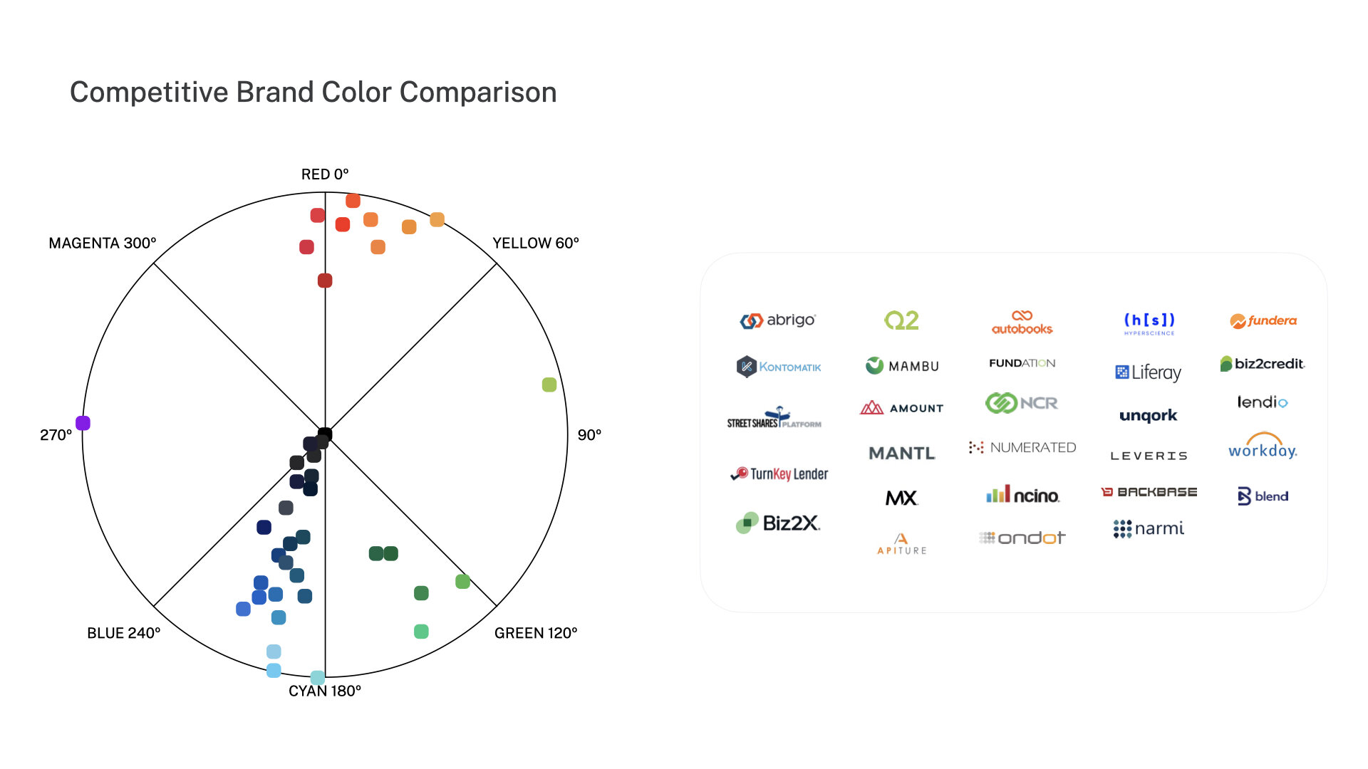

We also led a competitive study focused on the different brand expressions of our competitors. We took a particularly strong look at the competitors that were often against us in pitches based on the observations of the sales team.
Brand Positioning
Through a series of remote workshops I planned and facilitated, the team built the Linear’s MVP brand strategy, which consisted of its brand positioning and values.

The brand positioning framework below was inspired by Rippling’s in-house rebrand.
Brand Principles
We put security and trust at the forefront
Feels trustworthy and strong;
High quality and premium;
Makes sense as a fintech brand;
Enduring (no need to redesign in 18 mos)
We remember that humans use our products
Easy to scale and implement for various customers;
Supports product growth (current + future offerings);
Passes the sketch test (easy to draw)
We lead the charge instead of trying to catch up
Differentiate against competitorsjust enough;
Show innovation and creativity;
Share an "aha" moment
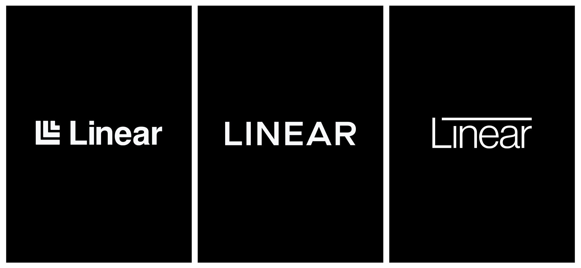
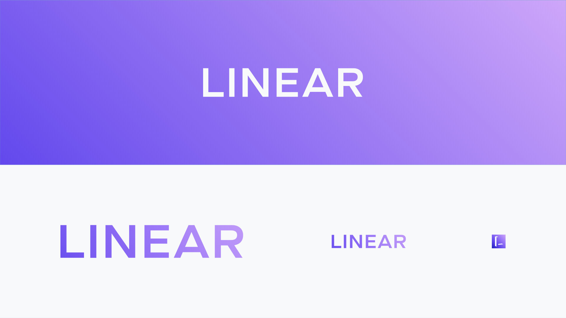
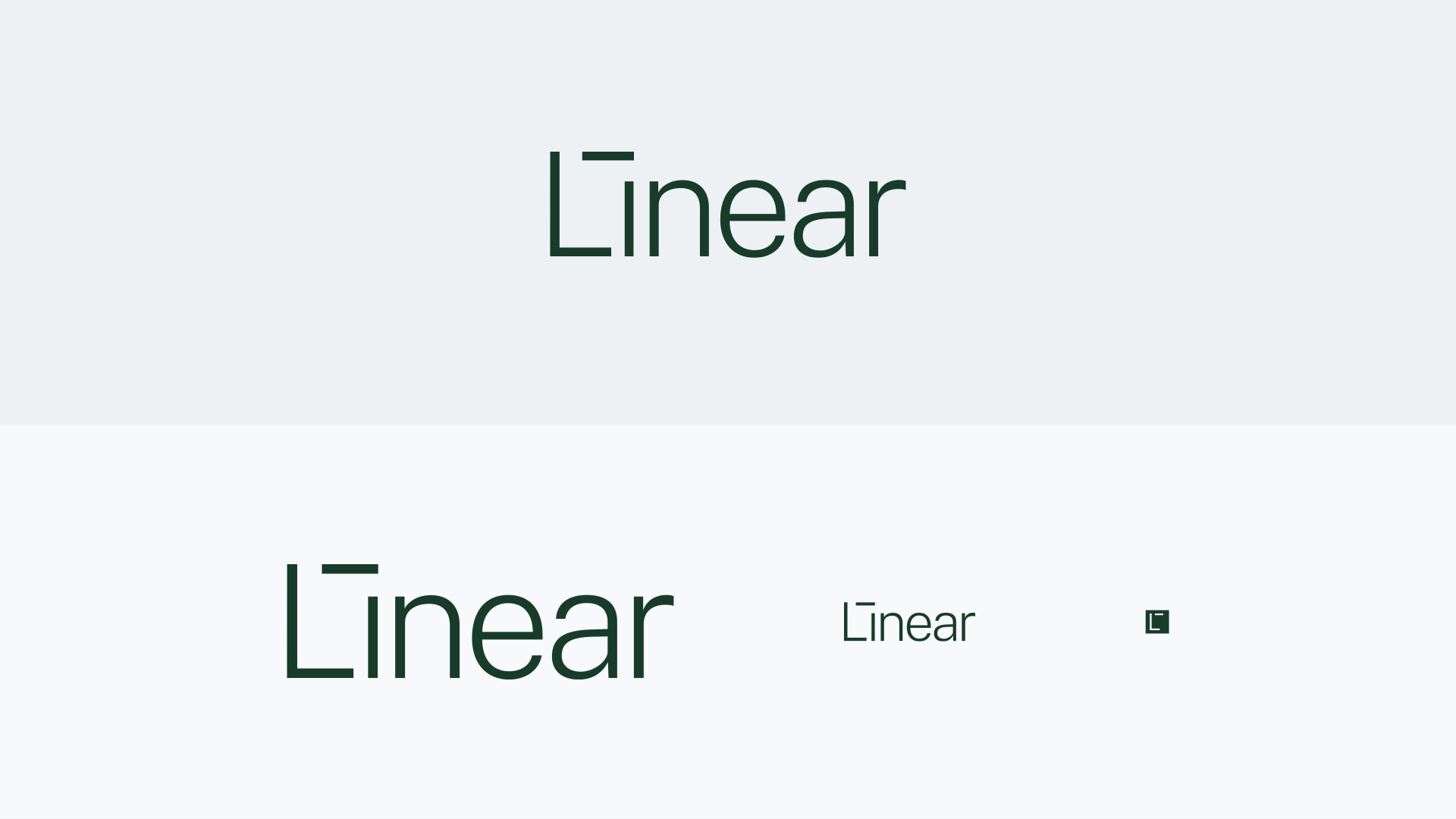
Exploring Different Directions
We explored three different directions to share with stakeholders. As design lead, I was in charge of project management, handling blockers, providing creative direction on each of the concepts, and working with the executives to identify a single direction to move forward with.
1 | Sophisticated and EmpatheticThe Future of FinTech is Human Connection
The products we create are powerful because of the people that build them. We combine what we know and what we imagine the future can be through a modular platform with infinite configurations. We understand the need of our partners to have unique solutions without sacrificing the experience.
Linear is compassionate. First, we listen. Then, we build.


2 | Modern & SecureSafely Scale in a Digital-First World
We exist to empower financial institutions to provide world-class experiences for their customers no matter where they are. We know that money is deeply personal and our credibility is built on security features that last.
Linear believes that the best products are safe, simple, and scalable.
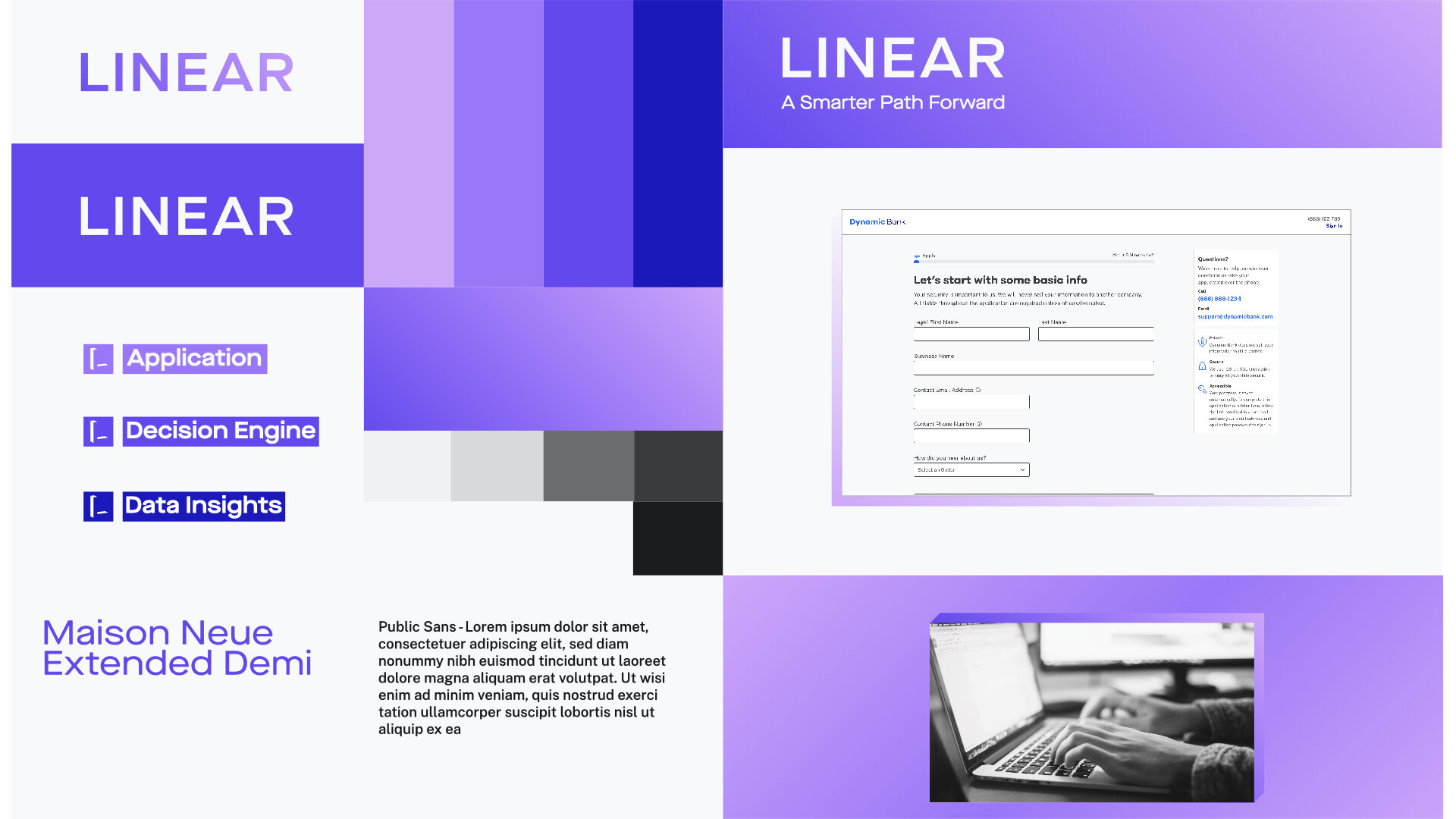

3 | Dynamic and InnovativeBuilding a Bigger and Better Sandbox
The ability to quickly adapt to the changing needs of the market is essential for financial institutions to succeed. We think outside the confines of what exists to build dynamic products. Being in a heavily regulated industry doesn’t equal “boring” experiences.
Linear believes that pushing the boundaries of innovation will set you apart.


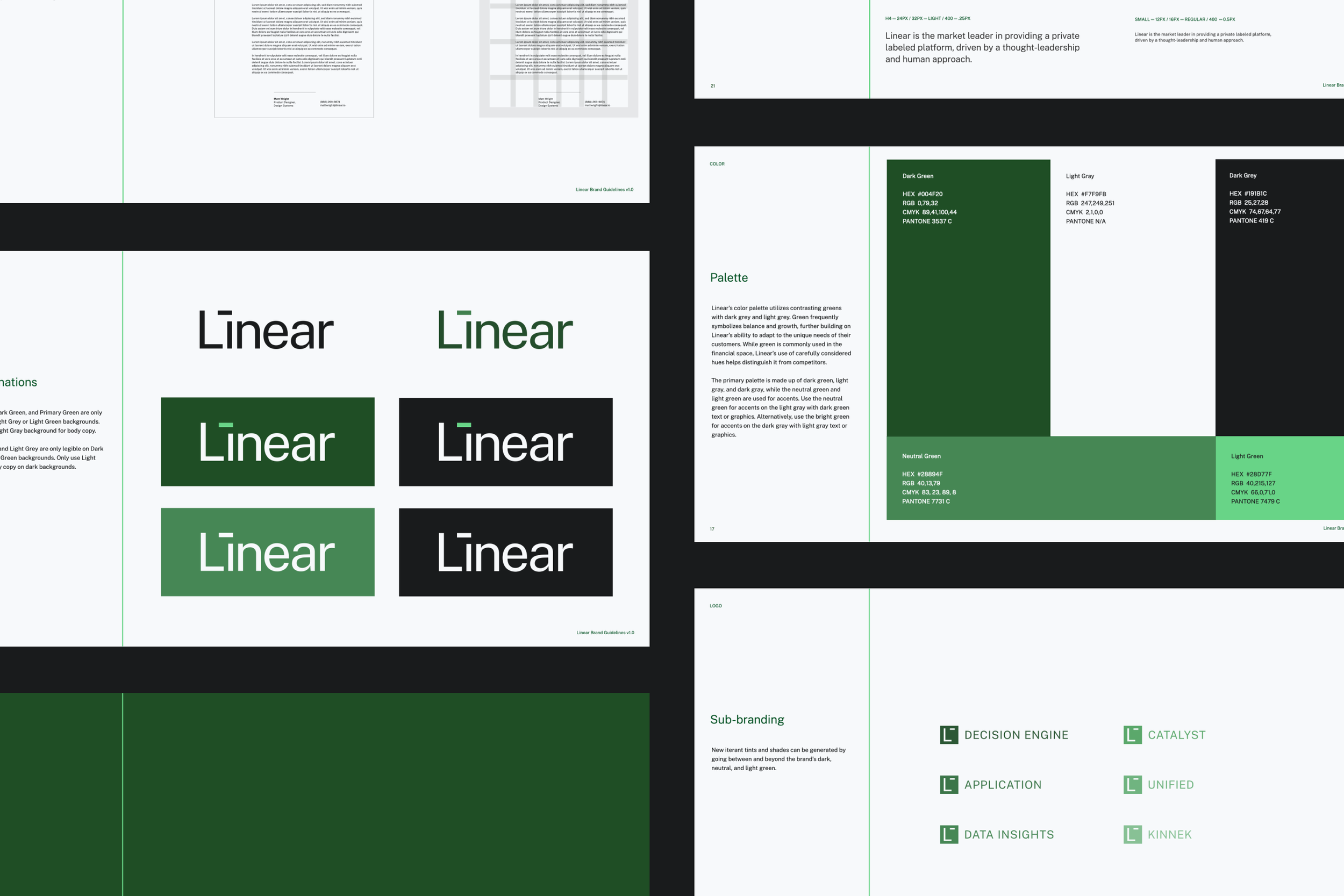
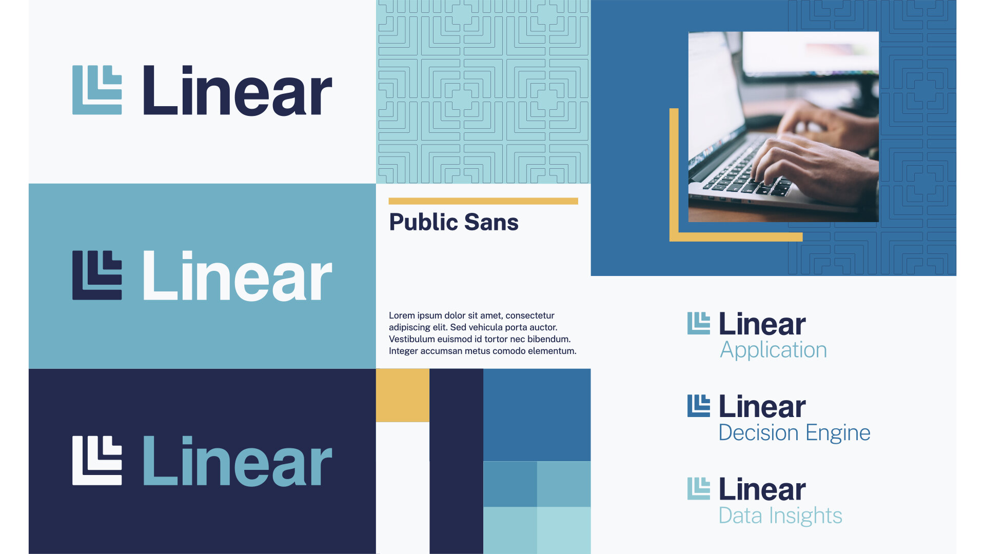
Introducing the Linear Brand
The design team and our stakeholders unanimously felt that concept 3 was the strongest, and the team spent the remaining two weeks putting it all together and refining every detail in preparation for our company launch.

The logo illustrates Linear's ability to push the boundaries of creativity and innovation. It is subtle in its simplicity, opting to show instead of tell. Its strength lies in setting the foundation for the viewer to visualize their own journey forward with Linear.
The box formed with the L and I is representative of our modular platform approach. Many people fill in the negative space with an arrow, and others see a human face- all crucial parts of our offering.

On a technical level, it alludes to the brand's grid system and can be abbreviated into a scalable logomark. By using the product’s highly readable typeface, Public Sans, it feels modern and unified with the rest of the brand.
The mark acts as a “stamp,” signifying the brand, technology, and standards associated with Linear in an iconic and easy-to-digest package.


Expanding the Brand
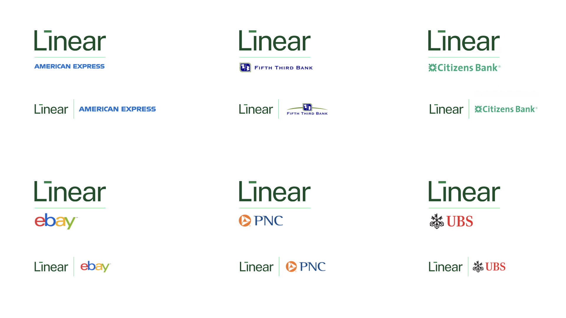
Linear’s brand identity allows us to sub-brand our products using simple lock ups and variations within our color palette. It also works when showing our brand in partnership with other companies.

The Grid
The grid system provides organizational structure and modularity. By adhering to the grid spacing, documents and other branded content are more easily developed while enhancing overall brand consistency.


Impact
Linear launched as a new company in February 2021
In 2 months…
🚀 MVP brand strategy created
👏 100% buy-in from executive stakeholders
💻 First brand portal created